

Custom Plastic Packaging: Smart Design Choices That Boost Product Appeal
2026-09-22
Walk down any retail aisle and you'll see hundreds of products competing for attention. The ones that win often share one thing: packaging that feels intentional. Custom plastic packaging isn't just about protection—it's a canvas for smart design choices. From shape and texture to clarity and color, every detail can boost product appeal. That's why brands turn to Sanrong Packaging for solutions that don't just hold a product, but sell it. Here, we'll break down the design decisions that turn ordinary plastic into a powerful marketing tool.
The Subtle Power of Matte vs. Gloss
Matte and gloss finishes do far more than sit on a surface—they shift how we read a room, an object, even a printed page. Matte pulls light inward, softening edges and muting contrasts. It feels quiet, tactile, almost absorbent. You want to touch it, not because it reflects, but because it seems to hold something back. Gloss does the opposite: it throws light outward, creating highlights that move as you move. It signals polish, precision, a surface that has been sealed and perfected. Neither is better; they simply speak different dialects of the same material language.
In practice, the choice between matte and gloss often comes down to context. A matte label on a wine bottle suggests craft and earthiness; a gloss label on the same bottle hints at celebration and formality. On walls, matte paint hides imperfections while making colors feel deeper and more muted. Gloss paint reveals every bump but adds a layer of reflective depth that can make a small hallway feel larger. The contrast becomes a design tool: pair a glossy ceramic vase against a matte linen tablecloth, and the vase suddenly looks wet, alive, while the cloth anchors it in stillness.
What often goes unnoticed is how the two finishes alter our sense of time and use. Glossy surfaces show fingerprints, dust, and scratches more readily—they demand maintenance, which makes them feel precious and slightly fragile. Matte surfaces forgive and forget, aging into a soft patina that feels lived-in. This is why high-traffic kitchens lean toward matte cabinets while a display shelf might feature a single high-gloss lacquer box. The subtle power lies in the tension: we are drawn to gloss for its momentary brilliance, but we rest in matte for its endurance.
Why Wall Thickness Changes Everything
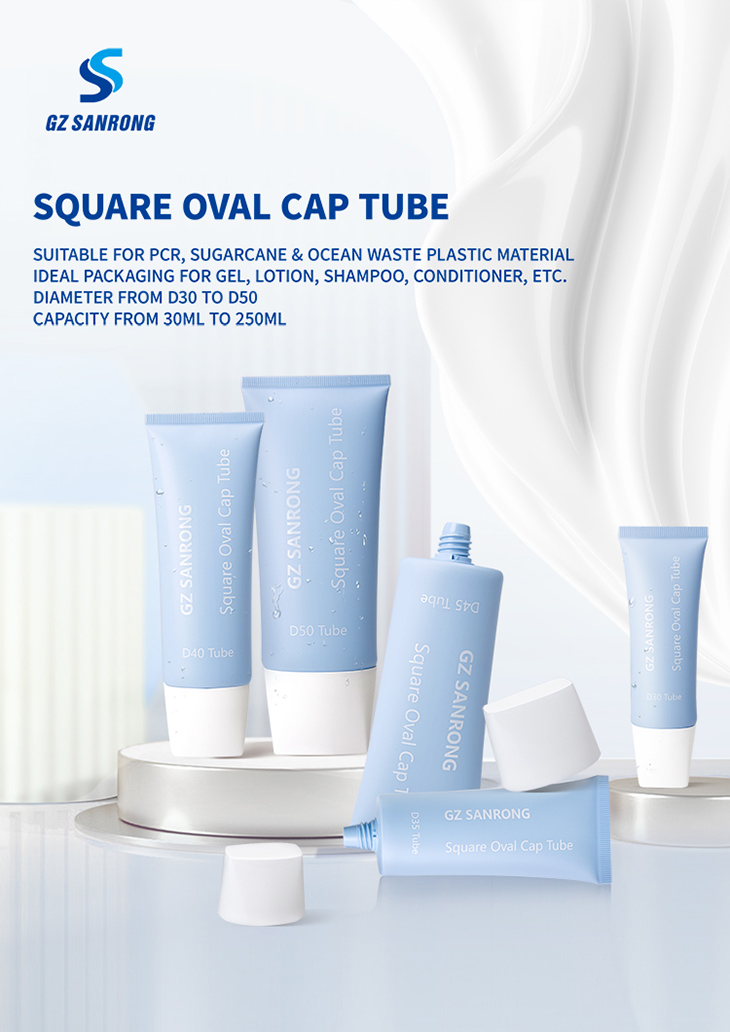
Most people assume a thicker wall simply means a stronger part, but that's only half the story. In injection molding, wall thickness dictates how molten plastic flows, cools, and shrinks. A uniform wall lets the material fill the cavity evenly, reducing internal stress. Vary the thickness by even a millimeter in the wrong spot, and you invite sink marks, warpage, or trapped air that no amount of post-processing can fully hide.
Thickness also controls cycle time and cost. Thicker sections hold heat longer, forcing the mold to stay closed while the core cools. That extra dwell time might not sound like much until you multiply it across ten thousand shots. Meanwhile, overly thin walls risk short shots or brittle edges that crack under load. Designers who nail the wall thickness early avoid expensive tooling revisions and save weeks of trial-and-error on the production floor.
The real trick is balancing stiffness with manufacturability. Ribs, gussets, and coring can replace bulk without sacrificing strength, but only if the base wall stays consistent. Once you understand that wall thickness is the silent variable behind every successful molded part, you stop guessing and start engineering from the inside out.
Color Choices That Stop the Scroll
Most feeds are a blur of white backgrounds and safe blues, which is exactly why a single block of electric coral or acid green can freeze a thumb mid-swipe. The trick isn't just picking a loud hue; it's placing that hue where the eye already lands—on a product shot, a headline, or the empty space around a call-to-action. A muted palette with one deliberately clashing accent often beats a rainbow of competing colors because the brain treats contrast as a signal worth investigating.
Consider the way deep violet pairs with a warm, buttery yellow. It feels less expected than blue and orange, but still carries enough tension to pull attention without feeling chaotic. Or take a near-monochrome scheme—say, three shades of sage green—and drop in a single dot of tangerine. That tiny disruption reads as intentional, and people pause to figure out why. The goal isn't vibration for its own sake; it's creating a visual pause that gives the message a chance to land.
Above all, color needs to serve the content instead of shouting over it. If every section fights for attention with neon gradients, nothing wins. But when one hero color is protected—used sparingly, repeated strategically, and surrounded by calmer neutrals—it becomes the reason someone stops. In a scroll-heavy environment, that restraint is often what makes the difference between being seen and being skipped.
Designing for the First Touch
The moment a user's finger meets the interface, the experience begins before any data is processed. Every element beneath that initial contact point must respond with a sense of immediacy and physicality. Shadows shift subtly, edges brighten just enough to confirm the hit zone, and the air around the press feels momentarily denser. This unspoken language of touch teaches users that their input has weight, that the interface is not merely a distant screen but a pliable surface shaped by their intent.
Developers often overlook the quiet power of that first press, treating it as a simple trigger rather than a conversation starter. Yet this is where trust takes root. A slight delay, a misplaced ripple, or an abrupt state change can shatter the illusion of direct manipulation. Conversely, a well-tuned response—perhaps a soft glow that radiates from the point of contact, a faint vibration that echoes through the finger—invites exploration. It says, "You are not just tapping a button; you are touching a living system."
Designing for this tactile premiere demands attention to the smallest thresholds. The press should feel like pressing into a firm sponge, not clicking a mechanical switch. Releasing the hold might trigger a gentle rebound, as if the interface exhales. When a user drags from that first touch, the element should follow with a natural, weighty resistance—never floating free, never lagging behind. These details are invisible on a spec sheet, but they define whether an app feels crafted by human hands or assembled from stock components.
Unboxing as a Brand Story
Every crease of tissue paper, the faint scent of custom ink, the weight of the box before the lid lifts—these details don't just protect a product, they rehearse the moment a customer meets your brand for the first time. Unboxing isn't a chore to rush; it's the opening scene of a story you've been writing since the first sketch. When you choose a matte finish over gloss, or hide a hand-written thank-you card under the folded flap, you're not adding flair. You're telling the customer who you are without a single sales pitch.
Think of the box as the book cover, the inner wrap as the title page, and the product itself as the first chapter. A dull gray mailer with a jumble of packing peanuts says "we cut corners." A rigid box with a magnetic close, a debossed logo, and a ribbon pull says "we thought about your hands before you even touched it." The tactile rhythm—peel, unfold, reveal—creates anticipation, and anticipation is the oldest storytelling trick there is. It turns a transaction into a scene the customer will narrate later: "You won't believe how it was packed."
But the story only works if it feels unforced. A box stuffed with every extra—stickers, seed paper, a QR code to a bloated brand film—reads like a writer who over-explains. The best unboxing experiences trust the product to land the final line. A single, well-placed detail, like a sleeve printed on the inside with a line of poetry or a care card that uses the customer's name, can do more than ten gimmicks. Because at the end, the customer doesn't keep the box. They keep the feeling of being understood. And that feeling is the only brand story worth telling.
Small Details, Big Perceived Value
People rarely remember the exact price they paid, but they always remember how a product felt in their hands. A slightly heavier remote, a softly textured button, the satisfying click of a dial—these tiny choices signal care. They suggest someone thought about the moment of use, not just the sale.
That perceived care translates directly into worth. When a zipper glides without catching, or a notebook opens flat without coaxing, the item seems more expensive than its price tag. It isn’t about adding luxury materials everywhere. It’s about removing small frustrations and adding small delights that accumulate into a feeling of quality.
The gap between ordinary and premium often lives in these overlooked details. A stitched edge instead of a glued one, a matte finish that resists fingerprints, a well-balanced lid that stays open—each one is quiet, but together they reshape how someone values what they own.
FAQ
PET or clarified polypropylene will get you a glass-like clarity without the cost of acrylic. A soft-touch matte coating on either one mimics the tactile feel of high-end cosmetic jars. Most of the premium sensation comes from the finish, not the raw material, so that swap keeps your budget in check.
Break the silhouette slightly. A curved leading edge or a tapered neck on a bottle draws the eye because organic shapes stand out among straight lines. But keep the base or the back flat so it still stacks and ships efficiently. It's a small change that can dramatically shift how the product is seen at arm's length.
Definitely. Deep blues and greens tend to communicate calm, trust, and natural ingredients, which works well for wellness or food items. Warm reds and oranges create urgency and appetite appeal, so they often suit snacks or limited-edition releases. Pair a bold outer color with a clear window to the actual product, and you give customers both emotion and honesty in one glance.
Focus on post-use utility. Design a container that becomes a desk organizer, airtight food storage, or a travel case for small items. Add features like a snap-fit lid, rounded edges for comfortable handling, and a label that peels off cleanly without residue. When the package serves a second life, customers see it as part of the product value rather than waste.
A fine matte ribbing or a subtle leather-grain pattern on the lid changes how the package feels in hand. It reads as deliberate rather than cheap, and it hides fingerprints far better than gloss. Keep the texture limited to one or two zones—like the grip or the top—so it whispers quality instead of shouting.
Consider the one-handed open-and-close. A flip-top cap with a satisfying click, a tear-away freshness seal that works cleanly, or a wide mouth that allows scooping without spills all improve daily use. These details may seem small, but they become the reason a customer grabs your product again instead of a competitor's awkward jar.
Reduce material thickness in non-structural areas, choose mono-material PET or HDPE that is widely recyclable, and design for disassembly—like a lid and base that separate easily. You can also use recycled content in the base while keeping a clear virgin layer only where visual clarity matters. This cuts environmental impact without sacrificing shelf appeal.
Overcomplicating it. Too many colors, mixed textures, and competing logos can make a product look generic or noisy. The strongest packages usually have one dominant visual idea—a distinctive shape, a clever lid, or a bold color block—and let everything else support it. Before adding another element, ask whether it helps the product get picked up or just adds visual noise.
Conclusion
Custom plastic packaging thrives on contrasts that quietly guide perception. A matte finish can whisper restraint while a glossy accent shouts modernity, and the tension between the two often makes a product feel considered rather than accidental. Wall thickness plays a similar game: a slightly heavier gauge transforms a flimsy container into something reassuringly solid, yet too much rigidity can feel over-engineered. The sweet spot lies in balancing heft with flexibility, so the package feels substantial without becoming a burden to open or hold. Color becomes the first hook in a crowded feed—unexpected pairings like deep teal with warm sand or a near-black plum with a single neon edge can stop a scroll in its tracks, but only if the hue aligns with what the brand promises beyond the shelf.
The moment a customer touches the surface, the story begins. A soft-touch coating invites lingering, while a finely textured grip suggests precision and care. That first physical contact sets expectations long before the product is revealed. Then unboxing takes over as a quiet narrative: a snug, friction-fit lid that releases with a gentle sigh, an inner tray that lifts the item like a stage, or a subtle debossed logo that catches the thumb—each small detail adds perceived value without adding cost. These micro-choices accumulate, turning a simple plastic shell into an experience that feels premium, intentional, and worth remembering. Ultimately, smart packaging design doesn't need to be loud; it needs to be felt.
Contact Us
Contact Person: Alex Wu
Email: [email protected]
Tel/WhatsApp: 86-20-37965868
Website: https://www.gzsanrong.com/en.html